
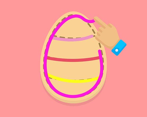
Hey bru. Last month I launched my first app Icing Addict - one of 12 startup projects I’m building this year. This series is a deep dive into how I built it.
Just getting started with Flutter? Check out the first post or the game itself here:
Alright so this post is intended to showcase how I use animations in my Flutter app.
I have tons of examples which include videos, high level overviews, and code to get you started.
As always get in touch if you have any questions. Let’s do this!
My post is intended to inspire you and get you started. As such I won’t go into the nitty gritty details of the animation code.
Instead use these links for more info on Flutter animations (they do a much better job anyway):
I’ve uploaded a few gists which I will reference throughout this post. These are:
StateDelay - Provides common timer functionality and util methods to stateful widgets.FirstLoad - Run functions that require an initialised context when a widget first loads.AnimatedInt - Implicitly animates an int to the given value.AnimatedScale - Implicitly scales a widget with an optional delay.Aight let’s start off with scale animations. I use these to pop elements in and out nicely.
Combine these with a delay and you’ve got a great combo to make elements stand out 👌
The first thing you see in my app is the splash screen. I thought why not make it pop?
As you can see the logo animates nicely on load.
I would prefer not to have a splash screen but I use it to load my home screen assets before showing them.
This is how I made it:
I use my AnimateScale and FirstLoad code to achieve this. Note I also use the loadSvg function from last week’s post.
import 'package:flutter/widgets.dart';
import 'package:flutter_svg/flutter_svg.dart';
import 'animation_mixins.dart'; // See my code reference for this gist
import 'animation_widgets.dart'; // See my code reference for this gist

class AnimatedLogo extends StatefulWidget {
  @override
  _AnimatedLogoState createState() => _AnimatedLogoState();
}

class _AnimatedLogoState extends State<AnimatedLogo> with FirstLoad {
    bool _isVisible = false;

    /// Preload svgs before animating
    loadSvgs() => Future.wait([
            loadSvg(context, LOGO_RIGHT),
            loadSvg(context, LOGO_LEFT),
            loadSvg(context, LOGO_MID),
            loadSvg(context, LOGO_TEXT),
        ]).then((_) => setState(() => _isVisible = true));

    @override
    Widget build(BuildContext context) {
        onFirstLoad(loadSvgs); // I need context to be initialised so can't use initState

        return Visibility(
            visible: _isVisible,
            child: ConstrainedBox(
                constraints: BoxConstraints(maxHeight: 200),
                child: Stack(
                children: [
                    _AnimatedStar(LOGO_RIGHT, DELAY_3),
                    _AnimatedStar(LOGO_LEFT,  DELAY_2),
                    _AnimatedStar(LOGO_MID,   DELAY_1),
                    _AnimatedStar(LOGO_TEXT, 0),
                ],
            )));
    }
}

class _AnimatedStar extends AnimatedScale {
  _AnimatedStar(String svgPath, int delay)
      : super(
          child: SvgPicture.asset(svgPath),
          curve: Curves.elasticOut,
          delay: Duration(milliseconds: delay),
          duration: Duration(milliseconds: DURATION),
        );
}
Ok there’s a few things going on here.
I’ll focus on the stars and score animations here. Check out the next section for the popup animation.
To animate the score number I use my AnimatedInt function. It’s just a widget you can use like AnimatedInt(value: 99). Super easy.
The stars are similar to my main logo animation. I use my AnimatedScale widget on each of the star SVGs, and stagger the delay to create the effect.
I use popups to display content related to certain screens.
I like to pop them in and out to provide useful visual context as you can see.
To create this effect I simply wrap the built-in popup and apply a scale transition.
Check out the code below.
import 'package:flutter/material.dart';

// Creates a popup with the given widget, a scale animation, and faded background.
Future<T> showPopupDialog<T>(BuildContext context, Widget child) {
    return showGeneralDialog<T>(
        context: context,
        barrierColor: Colors.black54,
        transitionDuration: const Duration(milliseconds: 200),
        barrierDismissible: false,
        useRootNavigator: true,
        pageBuilder: (BuildContext buildContext, _, __) =>
            SafeArea(child: Builder(builder: (BuildContext context) => child)),
        transitionBuilder: (context, animation, _, child) {
            return ScaleTransition(
                scale: CurvedAnimation(parent: animation, curve: Curves.decelerate),
                child: child,
            );
        },
    );
}
Sometimes content isn’t ready when a screen loads. Instead of having content jump into view, I like to animate the content into view.
You can see in the video that the scores load slightly after the page loads. The container animates nicely to accommodate this.
To do this I wrap content in the built-in AnimatedSize widget. Now any parent container will animate when content changes size!
import 'package:flutter/widgets.dart';

class GrowbleContainer extends StatefulWidget {
    final Widget child:
    GrowbleContainer({this.child});
    createState() => GrowbleContainerState();
}

class GrowbleContainerState extends State<GrowbleContainer> with TickerProviderStateMixin {
    @override
    Widget build(BuildContext context) {
        return AnimatedSize(
            vsync: this, // Provided by TickerProviderStateMixin
            duration: Duration(milliseconds: 200),
            curve: Curves.fastOutSlowIn,
            child: widget.child,
        );
    }
}
I use a common button throughout my app which I show/hide dynamically.
I thought it’d be nicer for them to pop in and out as you can see.
Much cooler than just having them appear suddenly no?
You can achieve this by wrapping a widget with my AnimatedScale widget and updating the scale dynamically like this.
import 'package:flutter/material.dart';
import 'animation_widgets.dart'; // See my code reference for this gist

class PoppingContainer extends StatefulWidget {
  final Widget child;
  final bool visible;
  PoppingContainer({
    this.child,
    this.visible = true,
  });

  @override
  State<StatefulWidget> createState() => PoppingContainerState();
}

class PoppingContainerState extends State<PoppingContainer> {
  @override
  Widget build(BuildContext context) {
    return AnimatedScale(
      tweenInit: Tween(begin: 1.0, end: 1.0),
      tween: Tween(begin: 0.0, end: widget.visible ? 1.0 : 0.0), // Update scale dynamically
      duration: Duration(milliseconds: 600),
      curve: Curves.elasticOut,
      child: widget.child,
    );
  }
}
This section covers how I use transitions to make navigating between screens more interesting.
One amazing feature of Flutter is the ‘hero’ animation support. This is where an element will transition between two separate screens.
My video shows an example where my cookie is animated to and from the select screen and game screen.
It’s so incredibly easy to implement that you have no excuse not to use it!
You literally just have to wrap a common widget with the Hero widget on each screen.
Hero(
    tag: "some_unique_string_id",
    child: YourWidget(),
),
The animation is done automagically and handles scaling and translations 👌
Note that you can’t have multiple widgets on one screen with the same ID (like the cookie select screen in the video).
In my case I use the level name so that each ID is unique, but still available to use from the select and game screens.
In the hero animation video above you’ll notice there’s a fade transition going on too.
You can implement this easily as follows:
import 'package:flutter/widgets.dart';

/// Fades to a new route rendering the given widget.
class FadeRoute<T> extends PageRouteBuilder<T> {
    FadeRoute(Widget page)
        : super(
            pageBuilder: (_, __, ___) => page,
            transitionDuration: const Duration(milliseconds: 600),
            transitionsBuilder: (context, animation, secondaryAnimation, child) =>
                FadeTransition(opacity: animation, child: child),
            );
}

/// Simple wrapper which fades to a new route rendering the given widget.
Future<T> fadeToRoute<T>(BuildContext context, Widget page) =>
    Navigator.push<T>(context, FadeRoute<T>(page));

// Use manually like this
Navigator.push(context, FadeRoute(MyWidget()));

// Or use the wrapper like this
fadeToRoute(context, MyWidget());
Sliding is also quite easy to do. This code slides in and out from the left of the screen
import 'package:flutter/widgets.dart';

/// Slide right to a new route rendering the given widget.
class RightSlideRoute<T> extends PageRouteBuilder<T> {
    RightSlideRoute(Widget page)
        : super(
            pageBuilder: (_, __, ___) => page,
            transitionsBuilder: (_, animation, __, child) => SlideTransition(
                  position: Tween<Offset>(
                    begin: const Offset(-1, 0),
                    end: Offset.zero,
                  ).animate(animation),
                  child: child,
                ));
}

/// Simple wrapper which slide right to a new route rendering the given widget.
Future<T> slideToRoute<T>(BuildContext context, Widget page) =>
    Navigator.push<T>(context, RightSlideRoute<T>(page));

// Use manually like this
Navigator.push(context, RightSlideRoute(MyWidget()));

// Or use the wrapper like this
slideToRoute(context, MyWidget());
Here are some other ways I use animations in my app.
Why flip between images when you can slide between them?
I use a great library called flutter_swiper which provides all sorts of sliding magic.
Here you can see I use it to navigate between content. You can interact with it too!
One extra thing here is how I’m animating the background. I use the built-in AnimatedContainer and simply update the colour when the slider updates.
This code shows how I set up the slider widget and animate the background as it slides:
import 'package:flutter/material.dart';
import 'package:flutter_swiper/flutter_swiper.dart';

class SwiperExample extends StatefulWidget {
  final List<String> images;
  final List<Color> colors;
  SwiperExample({this.images, this.colors});

  @override
  SwiperExampleState createState() => SwiperExampleState();
}

class SwiperExampleState extends State<SwiperExample> {
  int _imageIndex = 0;

  @override
  Widget build(BuildContext context) {
    var color = widget.colors[_imageIndex % widget.colors.length];

    return AnimatedContainer(
      color: color,
      duration: Duration(milliseconds: 1500),
      child: Swiper(
        loop: true,
        autoplay: true,
        autoplayDelay: _TRANSITION_DURATION,
        onIndexChanged: (index) => setState(() => _imageIndex = index),
        itemCount: widget.images.length,
        itemBuilder: (BuildContext context, int index) {
          var image = widget.images[index];
          return Image.asset(image);
        },
      ),
    );
  }
}
I built a custom colour picker for my app. It’s a simple scrollable list which you can see in the video.
A problem I had when I launched was that users didn’t realise the list was scrollable!
So I added a nice little animation which indicates that there are more colours to choose from.
As you can see the widget scrolls slightly when the list is loaded.
Check out my list slider gist which contains the widget. Use it like any another list: ListPicker(children: <Widget>[...]).
It basically wraps the built-in SingleChildScrollView widget and performs a scroll on load. It’s was a little tricky to get right but it was worth it.
I created my own button widget to achieve a particular style I was after.
Unfortunately that meant I had to roll my own animations too!
You can see in the video that I have a subtle press state animation as the user clicks the button.
To implement this I use the AnimatedContainer widget and adjust the shadow size and margin to make it looked pressed.
Check out this code which creates the shadow look, and animates it when pressed or not.
import 'dart:math';
import 'package:flutter/material.dart';

const double _SHADOW_SIZE_MIN = 2.0;
const double _SHADOW_SIZE_MAX = 6.0;

class ShadowContainer extends StatelessWidget {
  final Widget child;
  final bool isPressed;
  final EdgeInsetsGeometry padding, margin;

  ShadowContainer({
    @required this.child,
    this.isPressed: false,
    this.padding = const EdgeInsets.symmetric(horizontal: 16, vertical: 12),
    this.margin = const EdgeInsets.fromLTRB(5, 5, 5, 10),
  });

  @override
  Widget build(BuildContext context) {

    // Make the shadow large when normal and small when pressed
    var shadowOffset = isPressed ? _SHADOW_SIZE_MIN : _SHADOW_SIZE_MAX;

    // Adjust the button down when pressed and up when normal
    var marginOffset = isPressed ? _SHADOW_SIZE_MAX - _SHADOW_SIZE_MIN : 0;
    var marginTop = EdgeInsets.only(top: marginOffset);
    var marginBot = EdgeInsets.only(bottom: marginOffset);

    return AnimatedContainer(
        child: child,
        padding: padding,
        margin: margin.add(marginTop).subtract(marginBot),
        duration: Duration(milliseconds: 30),
        decoration: new BoxDecoration(boxShadow: [
          BoxShadow(
              color: Colors.black,
              offset: Offset.fromDirection(pi / 2, shadowOffset))
        ]));
  }
}
Well that’s it! Hope you learned something or were inspired to add animations to your app.
Once you get the hang of them Flutter animations are quite simple to implement. All you have to do is start!
As always reach out if have questions and see you next time!